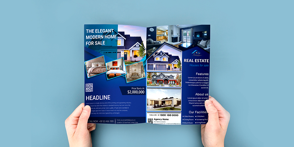
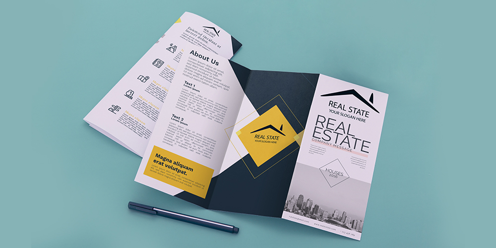
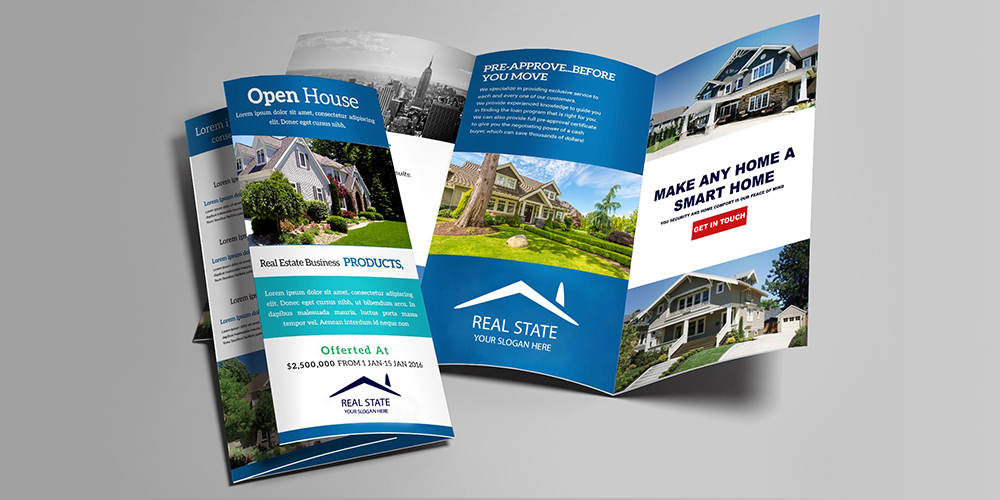
Designing a real estate brochure may seem simple and easy. But the truth is, real estate brochure design can be challenging when aiming to create a perfect piece that truly draws attention. A proper design brings credibility to your business, informs your audience, and encourages them to use your services. Print marketing materials with the right colour and font, valuable content, and on quality paper are more likely to be kept or passed on to potential customers. Here are some important and expert tips to help you grow your real estate business.
Read more: Are Printed Brochures Still Viable in Our Digital World
What to Consider before Designing a Real Estate Brochure?
There are different factors affecting your brochure’s impression on the audience. So, before printing, consider a list of important details carefully, including overall layout, font choices, and the quality of images for the best result. The following tips will help you design an appealing real estate brochure to attract more and more customers.
Read more: Essential Parts of a Real Estate Brochure
1. Know Exactly What You Want to Achieve
The very first step in designing any print marketing tool is to determine what it is for. What is the purpose of the brochure you’re going to design? To introduce an open house? To advertise a new listing? Or to inform the audience of your customer service? The answers will point you in the right direction.
From the start, establish some goals. This will enable you to create a real estate brochure that fulfills its intended function. Consider what you would like your readers to do after reading it. Always keep in mind that your design communicates directly to prospective customers.
2. Identify the Target Audience
Real estate marketing materials are used for communicating your marketing messages to a specific audience. Knowing “who you are designing for” will help you make the most effort to get the target audience to notice your marketing message. Finding the traits that your current clients share, especially those with whom you do the most business, will help you determine your target audience. Try to consider all the demographic data, such as average age, gender, and financial and social factors.
Try to find out what information your customers seek, what problems they may come across when doing business with you, and what your solutions will be. This information can be collected from different sources. Asking your past and current clients or your fellow agents for advice is one of the easiest and most reliable ways.
3. Understand the Power of Words

The wording of a brochure can determine up to 70% of its effectiveness. Writing well or poorly can make or break your business when it comes to marketing. Carefully consider each word or phrase before incorporating it into your finished design. Use strong language to highlight the credibility of your brand when introducing your real estate business.
Brochures about real estate are an excellent way to tell potential customers about the advantages of working with you. Use the words creatively to grab readers’ attention, but avoid over-exaggeration in your claims. Above all, be honest with your audience. Do not offer to do something you can’t. Smart consumers quickly realize that the reality is completely different.
4. Create a Unique Real Estate Brochure Design
When it comes to designing a brochure, the first impression counts. The design and layout of your work are as important as its wording. A proper, eye-grabbing design guarantees that your marketing message is noticed and read by prospective customers. To establish your brand and stay ahead of the pack, your marketing materials should be as unique as what you offer.
Being different is the secret to being noticed. Create an eye-catching, elegant design for your branded real estate brochure. Incorporating high-resolution images into the design is essential for producing a truly remarkable brochure. Nearly everyone owns a smartphone these days, which allows them to take average pictures. Use it! Keep in mind that your customers are intelligent enough to tell the difference between superior and subpar photos.
5. Choose Appropriate Fonts

In professional brochure design, the use of fonts is another important consideration. Your marketing tools’ visual appeal and text readability are greatly influenced by the fonts you choose. Use a recognizable font relevant to your brand identity. Despite its allure and fun, using different fonts can backfire. You do not want your brochures to appear gimmicky, unprofessional, or disorganized. Typically, a brochure consists of the text body, a heading, and a subheading. Therefore, you only need three fonts.
6. Come Straight to the Point
A brochure’s content should be presented as simply, concisely, and logically as possible. Do not explain things with ambiguous or complex language. Keep in mind your design’s purpose and target audience. If your marketing materials do not convey your intended message to the target audience, they will be completely useless.
Avoid compiling a list of a company’s accomplishments or including every single detail about a property. It is intended to be a brochure, not a book, after all. Unnecessary information just makes your work confusing and boring. Instead, focus on your company’s most prominent features that you think your target client will find interesting.
7. Work on the Headline
After graphics and visuals, the headline is the first thing that captures readers’ attention. Make sure your headline tells readers the entire story. If you are creating advertising for a product or service, for instance, the headline should explain how it will benefit the users. Do not put the company’s details in the headline. Even though this kind of information is essential, the headline should not include it.
8. Add a Call to Action

After deciding on photos, colours, font, headline, and brokerage information, it is time to write a call to action. Use persuasive words to get the readers to take the action you wish. Put a statement that invites the audience to view your listings, visit your website, or offer discounts. For maximum engagement, put your call to action where it can be immediately spotted by the readers. Using larger and bolder fonts or different colours is also a good idea to highlight your call to action better.
Final Words
In conclusion, real estate brochures are powerful marketing materials to advertise the best deals on properties you offer. If you are new to graphic design, pre-designed layouts and templates will help you save time and energy. AgentPrint provides you with a great number of DIY design templates to create your custom design.
We hope you find this content useful. Please share your views with us.

This is a very good guide that should be referred to before designing a real estate broucher. Thanks for sharing and keep up the good wotk
we’re happy you find our articles useful. Hope to see you again!