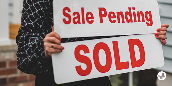
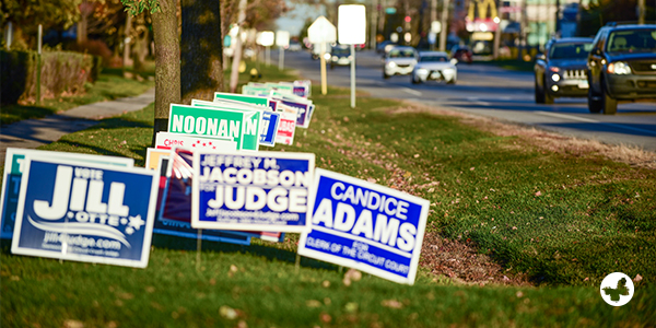
Yard signs serve as silent promoters for your real estate dealings. They attract the attention of future buyers, share vital property data, and display your professional persona. It’s important then to ensure they’re top quality and thoughtfully designed to make a lasting impression in the competitive real estate market. Below you’ll find a user-friendly step-by-step guide to help you make a standout yard sign for your real estate business. Let’s dive in!
Create an Exceptional Real Estate Yard Sign in 7 Steps
Define Your Sign’s Purpose and Message

Your yard sign’s effectiveness lies in its purpose and main idea. Consider it a mini billboard whose job is to catch the eye and share key information. Is it announcing an open house? Unveiling a new property on offer? Or maybe your sign’s mission is to market your agency, letting passersby know how to get in touch. The key is to put forward a clear and concise message to avoid misunderstanding. Remember, in today’s fast-paced world, you’ve got about three seconds to get your message across. Be clear. Be brief. State your purpose.
Choose Durable, Quality Materials
Picking the right materials for your yard sign is key to appearing professional and maintaining longevity. Settling for lesser quality can have signs disintegrating or falling apart quickly, damaging the image of your business. Look for options like Coroplast, which is both lightweight and strong, aluminum, known for resisting bad weather, or eco-friendly PVC as a green alternative. By choosing top-tier materials, you not only boost your brand image but also make sure the sign stays visible, no matter the weather conditions. Remember, a well-crafted sign is an indication of the trustworthiness of your real estate services.
Select the Best Size and Shape

Selecting the perfect size and shape for your yard sign is crucial for enhancing its visibility and meeting the specific location’s needs. Typically, 18″ x 24″ signs are standard in the real estate industry. However, larger properties might call for a bigger, 24″ x 36″ version for increased prominence. Additionally, experimenting with different shapes can give your signs their signature style. While rectangles are popular, don’t hesitate to explore squares or even custom shapes that could make your signage stand out. In the end, a well-proportioned and uniquely shaped sign captures attention and adds visual appeal to your real estate promotion efforts.
Get Creative with Design
Designing your yard sign can be a fun and rewarding task. Just remember to keep it professional yet eye-catching. Begin by choosing vibrant colours that contrast strongly with your sign to ensure it can be seen clearly from far away. Check that your selected colours match your business logo and are consistent with your overall branding. When picking fonts, go for easy-to-read styles for your headlines and smaller text. Serif or sans-serif fonts like Arial, Helvetica, and Times New Roman are usually top choices due to their readability in different sizes. Next, think about branding. Beyond your business logo, consider adding your business tagline or catchphrase to strengthen your brand identity.
Including professionally taken, high-quality images can also enrich your design visually. These could be a snapshot of the property, detail of the building, or something unique about the surrounding area. Just ensure you have the proper copyright permission to use any images.
Finally, less is more when it comes to sign design. Avoid overcrowding by focusing on key information. Keep the design balanced and symmetrical for visual appeal, but don’t be afraid to add some strategic design elements to spice things up and break redundancy.
Review and Proofread Thoroughly

Thorough checking and proofreading are crucial to ensure your yard sign’s design is perfect and its message conveyed. Review the design elements, looking out for and correcting any noticeable or slight flaws. Eye every bit of text: verify all contact information and property details, and double-check spelling and grammar. Ask someone who hasn’t been involved in the project to take a look at the design and text — they might catch errors you’ve missed. This ensures your yard sign looks professional and can compete in the cut-throat real estate biz.
PlaceYour Order
After thoroughly reviewing and tweaking your sign’s design, it’s time to place your order. Partner with a reliable print provider like AgentPrint, which is known for balancing quality with cost-effectiveness, all while ensuring fast delivery. A committed service will meet your specifications while paying close attention to efficiency and detail in the printing process, ensuring your finished sign looks professional, draws attention in the marketplace, and successfully sends out its message.
Install Your Yard Sign Properly
The last step upon getting your yard sign is to install it correctly following the supplied instructions. These might suggest using a tough metal H-frame stake or, for larger signs, fastening to a wooden or metal post. Where you place the sign greatly affects its impact, so it should be in a spot with maximum visibility without obstructions. A well-positioned sign is pleasing to the eye and successfully communicates with potential customers or passersby. A properly mounted yard sign gives off a clean, competent image, reflecting your commitment to excellence in real estate.
Conclusion
By following this detailed guide, you’ll be able to create a fantastic yard sign that enhances your professional brand in the competitive real estate industry. Keep in mind, that your path to success in this sector calls for a mix of creativity and professionalism. Good luck!
We hope you find this content from AgentPrint useful. Please share your views with us.
