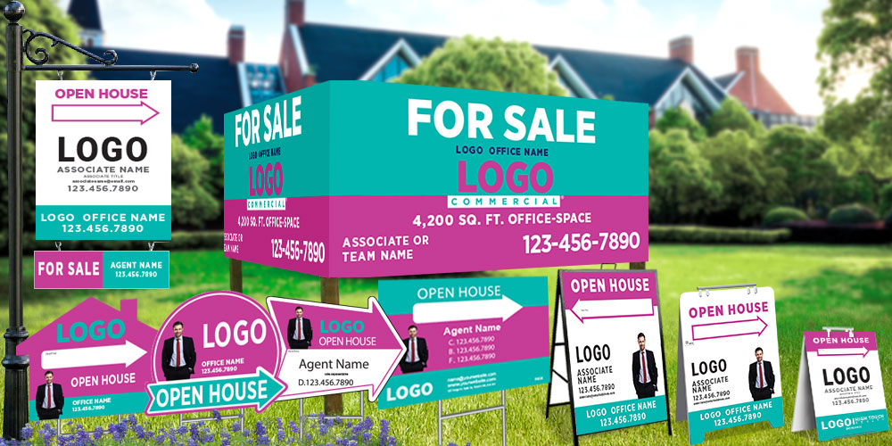
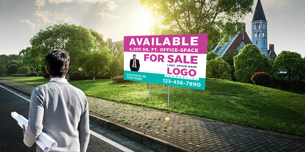
Though real estate signs are usually viewed as a tool to market real estate listings, they can reveal many things about a real estate agent’s level of professional expertise, trustworthiness, and quality of service. While you are there to market yourself in person, real estate signs can effectively communicate your message to the target audience.
In real estate, real estate signs play a crucial role in establishing brand identity. If you care how people perceive you, never leave the design of your signage to chance. With AgentPrint, you can rest assured that you will wow everyone with your professionalism and stand out above the rest. Here are the most crucial factors involved in designing an attention-grabbing real estate sign.
Design Considerations for Real Estate Signs
1. Branding
There is no denying that nowadays, branding is more important than ever. Branding can be viewed as a means to invite prospects to choose you over competitors. To last in real estate, you need to go further than simply letting the public know you specialize in residential or commercial real estate. You should find your unique selling proposition.
Branding not only affects the way people perceive the quality of your services but also allows them to know what to expect from you. Be cautious about branding; it won’t be easy at all to change people’s minds. Branding includes a brand’s name, logo, tagline, design, motto, symbol, and any other features that make your business and services identifiable to the potential market. The logo is the most important visual branding tool for any company. Make sure that you prominently feature your company’s logo on your real estate signs.
2. Brand Consistency

Consistency plays a significant role in building brand awareness. Consistency positively affects the way people think about your brand, strengthens your position in their minds, and helps you develop familiarity, trust, and loyalty between you and your audience. When designing a real estate sign, make sure that your marketing message is delivered in line with the brand’s identity, strategy, and values. Keep the design of your real estate signs consistent with the core message as well as other brand elements such as brand colours, fonts, and taglines.
3. Readability
Real estate signs are created to communicate with the potential market. To achieve this purpose, you need to make your design choices carefully. Though branding and aesthetic appeal are powerful strategies to attract buyers, they do not suffice. No matter how alluring a sign is, it will fail in its attempts to communicate the desired message unless it is readable to the target audience. Make sure that the texts are easy to read from a long distance and from moving cars. It is better to avoid using fancy fonts even if they tempt you. To increase the clarity and readability of your sign, it is recommended that you use straightforward serif or sans-serif fonts.
4. Impactful Appearance

Real estate signs are visual tools; they need to be arresting and noticeable enough. Whether you prefer a classic For Sale sign or a customized open house yard sign, impactfulness is a key factor driving buyers toward your listing. To maximize the effect of branding, you should reproduce your logo exactly on the sign. Proper colour choices can go a long way.
Pick a colour set that not only makes an immediate connection between your brand and your potential clients but also makes your sign memorable and impressive. Remember, poor colour choices can make a sign illegible. You can use your brand’s colours with contrasting colours to make your design more legible and eye-catching. Moreover, choosing bright, noticeable colours grabs attention at that very moment.
Pertinent Information
When designing real estate signs, it is neither possible nor necessary to include every detail. Depending on the purpose, your real estate sign should give the most relevant information to the prospects. For example, if the sign is supposed to promote an open house, it must represent the date, time, and address. In addition to the property’s details, the agent’s contact information, such as phone number, website, email address, etc., must be shared so that the interested buyers can contact him/her for more details or visit his/her website for more photos and videos from the listing.
Call to Action

A real estate directional yard sign is useless if it fails to inspire the required action. Now that your sign is appealing enough to draw the attention of passersby and drivers to your marketing message, it is time to accomplish the task by telling interested buyers what to do next. Let your customers know the next steps to take to buy the listing. Add an inspiring, persuasive call to action and invite the potential buyers to attend an open house, look at the detailed information on your website, or contact you for more guidance.
When done with designing your sign, think about the most appropriate place to put it for the best visibility.
We hope you find this content useful. Please share your views with us.
