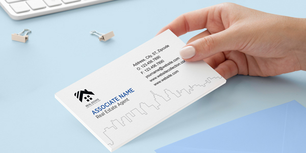
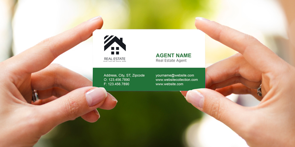
Real estate agent business cards are the most powerful way to share contact information and increase reputation and credibility in face-to-face meetings in the profession. These tiny cards act as a key to entering the real estate brand’s website and contacting agents by phone. However, creating an eye-catching real estate business card can be challenging because you have to put the most important information in a very small space.
Therefore, the card’s design should not only be eye-catching enough to draw in potential clients, but it should also contain all the essential information the recipient requires. To assist you in reaching your marketing objectives, we will examine the dos and don’ts of creating real estate business cards in this blog post.
Real Estate Business Card Standards
Business cards in the real estate market are a very effective marketing tool, so you can’t leave their design to chance! However, if you want your design to be successful, you must be aware of the requirements for a business card so that you can either follow them yourself or expect the designer to do so. Together, we explore some crucial prerequisites in this area:
Enter your license name and license number
Establishing trust in the recipient of real estate agent business cards is one of the expectations of its design. The most important way to gain trust is to add your work permit information. Therefore, be sure to include the brand name, license type, and registration number on the real estate business card. Additionally, you can summarize your major contributions and endorsements on this card.
Add logo
The real estate brand logo is one of the most important elements in the design of this card. If you haven’t designed a logo yet, you must do it ASAP because the logo increases your credibility and differentiates you from other brands. You can also use a unique design for the name and last name if the card is for a freelancer or brand consultant.
Contacts

Potential customers need your contact information to get in touch with you. An attractive business card can attract the attention of the viewers, but if your contact information cannot be found easily on it, they will throw it away. Some of the details to include on the business card to create productive interaction with the customers are:
- Business name
- Agent’s name (job title and expertise)
- Business website address
- Business address
- Businesses’ landline numbers
- Real estate’s cell number
- Social platforms address
Value proposition
One of the most important pieces of information that should be placed on your business card is the value proposition of the brand or brokerage. This refers to a tagline or text that identifies the need or needs of your target audience and the issue you plan to address. The brand’s value proposition is its promise, and in order for the audience to choose your offer over those of other brands, it must be both frank and exceptionally attractive.
Read More: Real Estate Business Card Design Guide
Business Card Mistakes to Avoid

The cost of a business card, even a luxury type, is not high compared to other print marketing materials and internet advertising costs. This implies that you might believe that your business card design errors are not that significant, but this is not true.
Note that a business card that does not meet your brand goals and advertising objectives is not only useless but may also cause the loss of a potential customer and a buying, selling, or mortgage and rental situation, and this means financial loss!
On the other hand, mistakes in business card design can reduce the credibility of the brand and the trust of its audience. Let’s review some of the mistakes that you should not make in organizing and designing real estate agent business cards:
Tiny or unreadable fonts
Don’t expect your audience to pick up a magnifying glass to read your words or the contact number on your business card. If you want to put a lot of content on the business card, you will have to use small fonts, but this solution reduces the possibility of reading the card information.
Strange or crooked fonts appeal to some people because they are unique. Perhaps using these letters will catch your audience’s attention at first, but this will only be helpful if they can quickly recognize and comprehend the words. Therefore, make sure to use legible fonts.
Lack of branding
After visiting several real estate agents, real estate clients have many business cards in their hands or pockets. The important thing is that they will remember the branding points on one of those cards out of all the others. The pattern’s attractiveness, the brand’s visual identity, and the way the goals of the brand are presented in the fewest possible words should all have been taken into account and used. Create a card that makes your brand stand out and helps people remember it.
Strange shapes and sizes
Being different is good, but it shouldn’t come at the cost of throwing away your business card. Make sure the business card is small enough to fit in a pocket or be carried around. Your business card will be thrown away if the customer cannot fit it in their pocket or bag.
Overcrowded or cluttered layout
If your business card has too much detail, the audience will be confused, and the first impression they will have is that your work is as messy as your business card design. Don’t make the audience feel overwhelmed when they see your business card, and throw it away right away. Don’t overcomplicate it; just include the essential details.
Using irrelevant images or stock photos
Do not put a stock picture of a house or property on your real estate business card. This is an unprofessional practice. Hire a professional photographer for an attractive portrait or a high-quality image of the property or your targeted neighbourhood.
Typos and misspellings
Don’t make a typo or misprint if you want your client to believe that you don’t take your work seriously. It is not acceptable to make a mistake on a business card with limited space. This proves that you don’t pay attention to details and makes your brand image unprofessional. So, double-check all the details and numbers, and correct the grammatical or design errors for a perfect business card.
Read More: Top Benefits of Business Cards for Realtors: Why Every Agent Needs One
What should you not put on a business card?

- Harsh and irrelevant colour schemes: Do not use harsh and irrelevant colour schemes for real estate agent business card design. In this context, in addition to using the colour spectrum used in the visual identity of your brand, consider the points of psychology and harmony of colours.
- Irrelevant shapes: Irrelevant shapes have no place on a real estate consultant’s business card, and it is better to use designs that evoke your field of work. Use minimalist designs with simple geometric shapes and lines.
- Slogans and exaggeration: Real estate agent business cards are not the place for motivational statements, long quotes, and a list of your brand goals.
- Photos of your files: These cards should not include multiple photos of your files; instead, they should persuade the customer to view them on your website or to visit your office or give you a call to learn more about the files you have for sale or rent.
Read More: What Information to Put on a Professional Real Estate Business Card?
Final Words
What you put on your real estate agent business card matters a lot. You should know exactly what to do and what not to do when creating your business card. You need to choose the right items and the appropriate place to put them. Find the font type, colour type, logo shape, readability of fonts, and necessary information that can establish the best communication with the customer.
At AgentPrint.com, our expert design and print team are ready to help you create eye-catching real estate agent business cards with every size, paper type, or print finish you need. Don’t hesitate! Contact us and use our long-term experience in printing real estate marketing materials.
