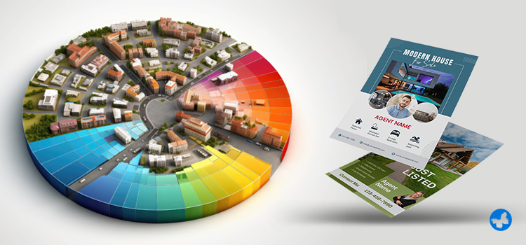
The world of real estate print marketing materials is a realm where visuals play a substantial role. It is where impressions are created by aesthetics, and the science of colours can influence choices. Colours have psychological effects that can affect decision-making, emotions, and trust. For this reason, picking the appropriate colours for real estate printing is crucial to making an impression that lasts.
Understanding the importance of colour for real estate is essential because the science of colours has shown that the majority of home-buying decisions are significantly influenced by colour. So, if you are associated with the real estate business, let us walk you through the fascinating journey of choosing the best colours that attract home buyers in Canada and how they can help the potential success of your sales.
Read More: How To Increase Sales In Real Estate?
The Importance of Colour Psychology in Real Estate Print Materials
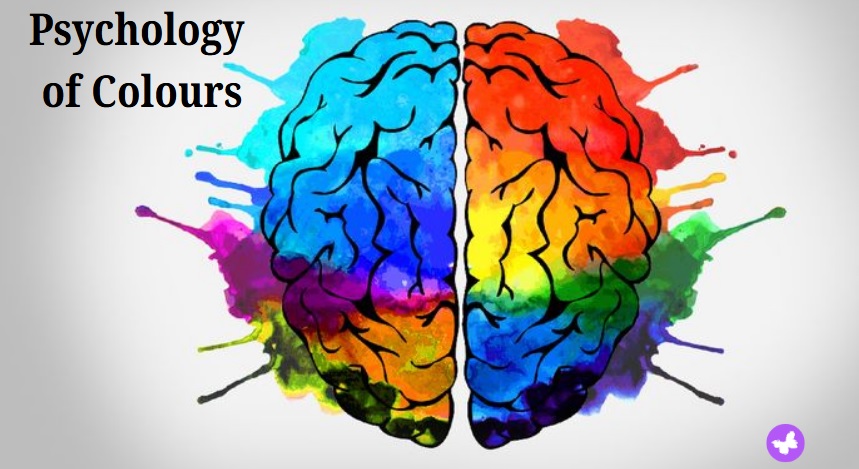
The human brain processes and organizes colour signals in a nanosecond. Colour is a universal language that even unconsciously influences our moods and responses. It has been demonstrated that real estate printing and the astute use of colour can simplify the purchasing and selling of properties. As a result, using the best colours for real estate is an evidence-based approach rather than a mere aesthetic choice.
The Emotional Power of Colours
The emotions that colours arouse in real estate print marketing have a big influence on how prospective purchasers view properties. Every colour has the power to evoke a special emotion in the viewer. Real estate agents can select colours that will appeal to their target market by being aware of these emotional associations.
The right colours can encourage people to call, visit your website, or attend an open house. Then, using consistent colour across all real estate print materials strengthens your branding.
First Impressions and Buyer Perception
Buyer perception is greatly influenced by print marketing materials, and first impressions are critical in the competitive world of real estate. These physical products can help potential customers remember your brand, build trust, and project professionalism.
In the real estate industry, where professionalism, urgency, and trust are crucial, the appropriate colour schemes can arouse feelings in both buyers and sellers. Your materials will stand out because some colours are more noticeable than others.
How to Choose Colours for Your Real Estate Brand?
A timeless wisdom in real estate printing is that neutral tones like beige or grey can attract a broad range of buyers. Still, depending on the desired outcome, these might not always be the best choices.
Specific colours have been proven to have certain effects on people. For instance, green has a calming effect and can even lower your heart rate. However, too much green can give a sickly look and might not appeal to buyers. A smart way to incorporate green is through biophilic design, where you bring in natural elements, like indoor plants, to the space. Let’s break down the impact of colour psychology in real estate marketing and branding.
The Effects of Colours on Emotions

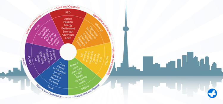
While there is a wide spectrum of colours, let us uncover the personality traits often associated with common colours in marketing.
- Blue: Reflecting honesty, cheerfulness, trust, and stability, blue is often regarded as one of the best colours for real estate. It can be employed in a wide variety of marketing materials, offering a sense of comfort to the viewer.
- Red: Bold and daring, red resonates with excitement. You should be careful about overusing this colour, as it could lead to anxiety. Use it wisely, as an accent, to invite attention to key features of a property.
- White: White is a fantastic background colour for real estate printing because it embodies professionalism, modernity, and simplicity. Beige, grey, and taupe are examples of neutral colours that exude sophistication and simplicity. They are ideal for corporate branding, luxury real estate magazines, and brochures.
- Green: This colour is appropriate for properties in natural settings or environmentally conscious branding because it symbolizes dependability and serenity. It can also be used to imply growth, wealth, and a connection to nature.
- Purple: Purple is frequently used to communicate elegance and charm. Feel free to use more purple in your flyers if your real estate company specializes in high-end properties.
- Gold: In the upscale real estate market, in particular, gold can be used to communicate exclusivity and wealth. You can use gold colour for designing your luxurious business real estate brand.
- Yellow/Orange: Yellow can be used to convey a positive, upbeat vibe because it radiates happiness. Orange is frequently used to draw attention to important details, like discounts or contact information. Your marketing materials will stand out and draw attention if you use these vibrant colours.
With these colour-emotion associations, you can strategically design real estate marketing materials that trigger the desired response in your potential clients.
Aligning Colours with Brand Personality
Think about how you could stand out from the competition, increase trust, and pique curiosity with the correct colour scheme. Consider the colour scheme of your marketing materials as your brand style, splashed across marketing items such as flyers, brochures, and business cards. This isn’t just a fancy trend. It’s about understanding the science of colours and using them to your advantage.
The right colours can make your brand unforgettable, effectively carving out a unique space for your business in a competitive marketplace. It is not just about selling properties anymore; it is about offering an exquisite experience or unforgettable emotion. With thoughtful use of colours, your brand can encapsulate these feelings. It’s time to paint your real estate world with colours that resonate with your clients!
Putting the Science of Colours into Practice
By applying the science of colours to real estate print products, you can more easily draw attention, arouse feelings, improve brand recognition, and motivate action. It is a straightforward and efficient method of fostering a sense of trust and friendliness with clients. Keep the following tips in mind:
- Don’t forget to consider your target audience; for example, use black, gold, and deep blue for luxury buyers, or use warm and friendly colours like orange or yellow for first-time homebuyers.
- Based on property type, you can use blue, grey, or black colours for commercial properties or soft blue and yellow for family-friendly options.
- Maintaining colour consistency across print and digital advertising materials is another crucial factor to take into account. Throughout the design and production process, you should pay close attention to colour profiles and uniform colour standards. This includes specifying colours using Pantone or other standards, calibrating monitors, using ICC profiles, and performing routine colour audits and proofs.
Using these techniques when creating your print marketing materials will demonstrate the transformative power of colour in influencing the choices of prospective customers.
Read More: What Is the Difference Between Digital Marketing and Print Marketing?
Common Colour Mistakes to Avoid in Real Estate Marketing
When designing print marketing materials for real estate, such as flyers and brochures, selecting the appropriate colours is essential to drawing in new customers and successfully communicating your brand’s message. The following are typical colour errors to avoid:
1. Ignoring Colour Psychology
Colours have psychological associations and elicit a range of emotions. If you choose colours for your brand and marketing materials without taking these associations into account, you risk sending the wrong message. Recognize the feelings and traits that are connected to various colours, then pick colours that complement your brand identity and the message you wish to deliver.
2. Inconsistent Colour Scheme
It can be confusing for potential customers and damage your brand identity to use different fonts and colours in all of your marketing materials. Create a brand-representing colour scheme and utilize it for all of your marketing materials, including business cards, yard signs, and flyers.
3. Poor Colour Choices
It can be visually startling and challenging to process your materials if you combine colours that don’t go well together, such as bright red and green. Bright colours can draw attention, but if you use too many or choose too bright shades, your materials will appear overwhelming and unprofessional. Specifically, neon colours may be linked to low-cost advertising.
Text and information become hard to read when colours that are too similar in shade, tint, or tone are layered together. This can also result in a drab, ugly design. To improve readability, make sure there is enough contrast between the background and text colours. Use neutral hues to balance them for a more elegant appearance.
Final Words
Knowing the science of colours can be very helpful when it comes to print marketing for real estate. Next time you select a colour for your business, keep in mind its persuasive strength—the ability to sway thoughts, share your message, and seal the deal. Additionally, the clever science behind colours can change your marketing strategy.
At AgentPrint.com, we are your stepping stone to success, providing fast, high-quality, affordable print solutions put together with leading-edge tech. Our professional design and print teams will guarantee the colour quality and consistency of your print products. After all, your victory in business is our shared joy!