Real estate business cards are a proven marketing tool at your business’s stage. It means you should make sure that you only put the necessary information in it. You should put yourself in your audience’s position when creating your business card and consider what they would like to know about you. People’s intention to get in touch with you can be strongly correlated with how they perceive the content of your business card.
Do not forget the principle that your business card is an opportunity to connect with a new customer. Do not underestimate the physical power of the business card and the ability to convey its feeling compared to the virtual space. Design it so that it doesn’t become a throwaway piece of paper but acts as a powerful connecting agent between you and your customers.
Read More: Top Benefits of Business Cards for Realtors: Why Every Agent Needs One
The Must-Have Elements of a Realtor Business Card
You are well aware of the significant influence this small piece of paper has on both current and potential clients since it shows that you are available to them. This is the point at which the card’s information starts to make sense. Let’s review some of the most important items you must add to your business card:
Company Name and Logo
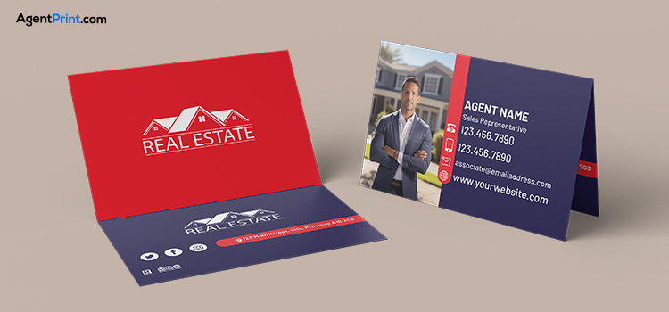
Your company represents your type of work and your professional identity. The customers need to know what company they are dealing with, and if they want to make inquiries, they can easily do so. The company name must be written in the largest font. This will create a better impression, and your company name will remain in the customers’ memories.
A key component of your brand’s identity and what sets you apart in the eyes of consumers is your logo. Its design should be aligned with your line of work in the best way possible to easily remind your customers of who you are and what you do. Having a professionally designed logo conveys the feeling that you are competent and authentic.
Your Full Name and Job Title
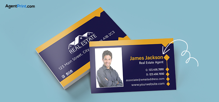
It is essential for professional networking that your business card bears your full name and job title. Recipients can easily recognize and recall you and your position within the organization because it makes it clear what you do and who you are. Using your full name, along with a popular nickname if that’s how you’re known, makes it easy for people to refer to you appropriately. It also strengthens the bond and adds personalization to your business card.
Your job title clearly defines your role and responsibilities by giving context for your interactions with the recipient. It makes it easier for people to comprehend the services you provide and your level of experience in your business. For example, the title “Marketing Manager” provides more information than the title “Manager.”
Contact Information (Phone, Email, Website)
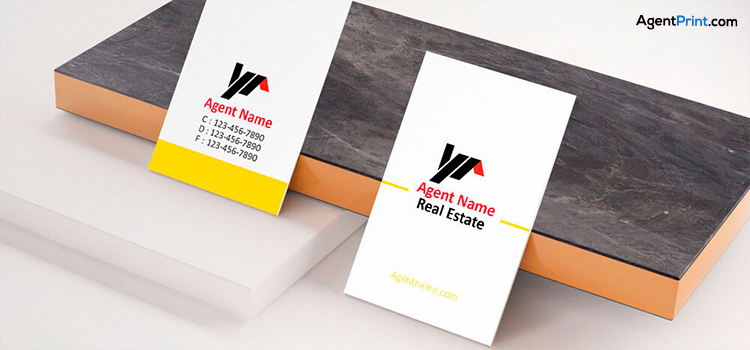
Including your contact details on your business card is essential if your objective is to enhance networking and business development. It offers a rapid and simple method for prospective customers to get in touch with you. Following a meeting or event, this information enables prompt follow-up, optimizing the possibility of new business opportunities.
Your digital contact details should visually complement your entire brand to provide a recognizable and consistent image on all platforms. If the potential partners or clients find it difficult to contact you, it may result in missed opportunities and lost revenue.
Website and Office Address

Including your physical address or website address on your business card will make it simple to access additional information about your company and, if applicable, make it easier for people to visit your location in person. It increases trustworthiness, facilitates accessibility, and provides a clear path to your web presence. Having a clear website address makes it simple for customers to learn more about your company, possibly contact you, or make a purchase.
The physical address could be especially crucial for local clients, even if you have an online strategy. Simply put, your real estate business card should serve as a convenient access point to all of the ways that customers can get in touch with your company, both online and offline.
Company License or Realtor ID
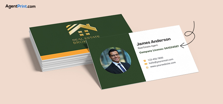
Establishing legitimacy, credibility, and regulatory compliance requires that your business card include your real estate license number and brokerage details. It proves that you are a qualified professional and enables potential customers to confirm your qualifications and association with a respectable brokerage.
By checking with your brokerage or the appropriate licensing board, potential clients can quickly confirm your credentials and license status. In many jurisdictions, real estate agents are required to include their license number on all business cards and other marketing materials.
Optional Yet Effective Elements
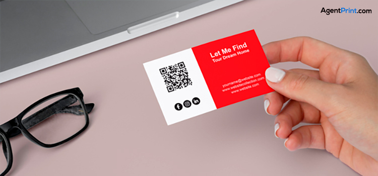
Every business card can benefit from secondary items besides the main ones. Additional items are things that do not necessarily need to be placed on your business card, but their existence can provide more information to people and make communication easier. The following items are optional but worth mentioning:
Tagline or Value Proposition
If you have chosen a tagline for your business, now is the time to use it. If you don’t have a tagline, write a summary of what you do in a few words. It immediately conveys the main idea and distinctive selling proposition of your company, increasing the impact and memorability of your card. It fosters deeper relationships and more meaningful exchanges by assisting prospective customers or partners in understanding what your company has to offer and what sets it apart from the competition.
For example, Adidas uses the taglines ‘Forever Sports’ and ‘Impossible is Nothing’ to clearly state what it specializes in. A few professional words, honestly focusing on its main service.
Social Media Handles
The ability of social networks to draw in audiences and clients is undeniable these days. Social networks give you a lot of flexibility and are the least expensive way to draw in new clients and ensure that they stay loyal. You can direct a customer to your activity page to learn more about your services by putting your social media profiles (LinkedIn, Facebook, Instagram, etc.) on your business card. Another benefit of this is that you will make wonderful friends with them who will end up becoming your devoted clients.
QR code
QR codes are for when your business card space is full and you want to use it efficiently. A QR code can quickly lead a customer to information about your hours of operation, special promotions, and your business story. This entails honouring the preferences of detail-oriented clients. Some customers want to know the finer details of your work at the very beginning of the work, and you respect them by doing this.
Read More: 6 Tips for Using QR Codes on Real Estate Print Marketing Materials
White Space
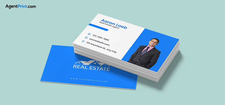
The meaning of “white space” is not necessarily the colour white but the space needed to create peace and trust in the customer. This will improve the visual appeal and readability. Avoid overloading the reader with too much information or text and indistinguishable spacing between them when outlining the content of your business card.
Surely, you don’t want to make the audience nervous and confused. So, create white space by removing unnecessary titles, replacing text with icons, and choosing minimalist template layouts.
Read More: The Do’s and Don’ts of Real Estate Business Cards
Should you use both sides of a business card?
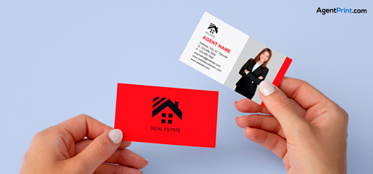
It is recommended to put the info on both sides of your business card. Additional information can be included, such as your website, social media handles, tagline, logo, or even a brief synopsis of your offerings. The back of your business card can be used for innovative CTAs to persuade recipients to follow you on social media, visit your website, or perform a particular action.
There are many variations you can go for. Here are some:
- All text on the front, only logo on the back
- Logo, company name, and your full name on the front; contact details on the back
- Logo, your first name, and contact details on the front, a catchy design on the back
- Photo, name, and contact details on the front; logo and company name on the back
Read More: How to Make Real Estate Business Card Stand Out in a Crowded Market?
Final Words
By concentrating on the right design, layout, and content, you can create a completely unique and more memorable business card. Consider the recipient’s perspective and what you would like to know about a real estate agent when you receive or keep a business card. You can ensure the ideal real estate business card by consulting with the design and print specialists at AgentPrint.com, which will make your job easier. Our team is always available to help you achieve your marketing and printing goals.
